Three pitfalls of plotting... and all in one plot!
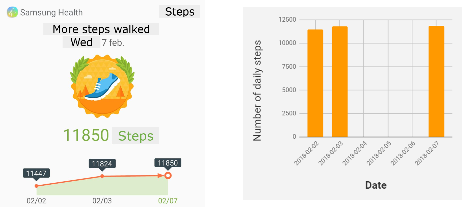
Some weeks ago my mother proudly sent me this screenshot from Samsung Health, which reported the number of steps she had walked over a period of time. Based on the big medal-like badge and the increasing trend of the plot, my mother was doing great.

Happy as I was for her satisfaction resulting from the reward of the app, the data scientist in me was perturbed. I had so many questions about the plot…
Why is the plot so small?

In other words, why are about two-thirds of the infographic wasted? I understand the logo of the app needs to take a relevant place. I can also understand that the date is provided – just in case you did not know it anyway. But do we need that gigantic badge eating so much space? And what is it telling us? We guess my mother must have walked a lot because of the laurel wreath. But how good is that? What other badges are there? Personally, I think the use of relatively conventional grading codes (e.g. numbers from 1 to 10, a color scale from red to green) would do a better job. Steps. I get it Samsung Health: this plot is about steps. It is quite clear from the badge and it would be explicit if labeled in the y-axis of the plot (I will come to this point later). So do we really need the “Steps” on the top right corner? And the “More steps walked” (15 characters to state something redundant and vague)? Just in case you didn’t know we are talking about steps, the putative total number* of steps is shown in green.
*I assumed that figure indicates the total number of steps in the given period of time (I discuss this point below).
What data are shown?
Intuition, which ideally should not be used to interpret a plot, tells me that the horizontal axis of the plot shows the period of time over which the steps were recorded. More intuition tells me that the units of such temporal axis are dates. Considering the diversity of date formats worldwide, the used labels are inaccurate. Does the data set span from February 2002 to the same month in 2007? It is unlikely unless my mother waited over a decade to tell me about her progress. Oh, then it has to be the records for the first days of February. Maybe. But millions of non-US readers would have likely opted for a time frame comprising February to July, whatever the year was.
I again need some thinking to guess what exactly the number of steps means. My first guess was that the plot showed the accumulated number of steps over a period of time. The connection between the data points, the arrow at the end and the area under the curve made me think so (I do not mean to be very critical with this point; it may be just a personal preference to not connect data points with lines). However, that would mean that my mother walked the worrying amount of 377 and 26 steps in 1 and 4 days, respectively (i.e. the differences between time points). Unlikely. So it must be that each data point is the number of daily steps. Thanks to a lazy search with Google I find that the women’s average stride length is 26.4 inches (or ~67 cm), so ~11,000 steps correspond to a bit over 8 Km – a reasonable daily walking distance.
To avoid all this guessing, something along the lines of the plot below would have much clearer.

What are the scales of the axes?
The scales of both the horizontal and vertical axes are tremendously wrong and thus misleading! Measurements 1 day apart are shown in the plot with the same distance as those that happened with 4 days of difference. We would need more data points, but it seems to me that Samsung Health just plots step values for record 1, 2, 3… totally ignoring the date of the record. And then we have the vertical axis: a classical hoax of data visualization. If you want to make changes look remarkable (when they are likely not), forget about including the lowest possible value (zero in this case) and tailor axis scale to your data as much as possible. Ironically, the change in the number of steps stills looks mild partly due to the large amount of space eaten by the decorations above the plot.
The pitfalls in short
The original plot iconizes very well key pitfalls we too often see in our data-rich world. So, whenever you make to ruin a plot:
- Allocate little space to the actual data and add multiple distracting decorations
- Do not make what data are displayed self-explanatory
- Use axes that just make the plot look nice –who cares about accuracy
As a final remark, the image below shows the original plot (left) and my version without the pitfalls above mentioned.
